Real Life Data Science: Exploring Clubhouse Data
04.19.2021
Real Life Data Science: Exploring Clubhouse Data
Hello! And welcome to an article on real life data analysis. Recently, I found a clubhouse user data set on Kaggle. I though using this data would be a good opportunity to go over how review growth for your company. The data set is small, but we can learn some basic from it. Also, if the data is accurate, it is fun to see how a trendy company is doing in real life. Let's get started.
The data set can be fround here. https://www.kaggle.com/johntukey/clubhouse-dataset
import numpy as np
import pandas as pd
import matplotlib
import matplotlib.pyplot as plt
import seaborn as sns
import sqlite3
Load the Data
Our first step is to load the data. The data was given a a sqllite db, so we first connect then run a select query to load all users into a dataframe.
Sql = sqlite3.connect('./Clubhouse_Dataset_v1.db/Clubhouse_Dataset_v1.db')
df = pd.read_sql_query("SELECT * FROM user", Sql)
View at the Data
Next, we will take a look at the data to get an idea. We start by looking at the first few rows.
df.head()| user_id | name | photo_url | username | num_followers | num_following | time_created | invited_by_user_profile | |||
|---|---|---|---|---|---|---|---|---|---|---|
| 0 | 4 | Rohan Seth | https://clubhouseprod.s3.amazonaws.com:443/4_b... | rohan | rohanseth | null | 4187268 | 599 | 2020-03-17T07:51:28.085566+00:00 | null |
| 1 | 5 | Paul Davison | https://clubhouseprod.s3.amazonaws.com:443/5_e... | paul | pdavison | null | 3718334 | 1861 | 2020-03-17T14:36:19.468976+00:00 | null |
| 2 | 8 | Johnny Appleseed | None | apple1 | null | srt_tester_9 | 20 | 81 | 2020-03-19T19:47:00.323603+00:00 | null |
| 3 | 10 | DK 🖍 | https://clubhouseprod.s3.amazonaws.com:443/10_... | dk | dksf | null | 49538 | 173 | 2020-03-19T23:38:52.574777+00:00 | null |
| 4 | 12 | Jonathan Gheller | https://clubhouseprod.s3.amazonaws.com:443/12_... | jonathan | jgheller | null | 21250 | 81 | 2020-03-20T02:30:22.188084+00:00 | null |
We look at the shape of the data and see that we have 1,300,515 rows. That's quite a lot of users. There are also 10 columns, so not a ton of detail about each user.
df.shape(1300515, 10)df.describe()| user_id | num_followers | num_following | |
|---|---|---|---|
| count | 1.300515e+06 | 1.300515e+06 | 1.300515e+06 |
| mean | 7.303800e+05 | 2.603839e+02 | 1.154931e+02 |
| std | 4.276844e+05 | 1.674231e+04 | 1.945045e+02 |
| min | 4.000000e+00 | 0.000000e+00 | 0.000000e+00 |
| 25% | 3.592120e+05 | 1.400000e+01 | 2.600000e+01 |
| 50% | 7.258520e+05 | 3.700000e+01 | 6.100000e+01 |
| 75% | 1.099280e+06 | 9.900000e+01 | 1.190000e+02 |
| max | 1.499999e+06 | 4.187268e+06 | 2.504000e+03 |
df.info()<class 'pandas.core.frame.DataFrame'>
RangeIndex: 1300515 entries, 0 to 1300514
Data columns (total 10 columns):
# Column Non-Null Count Dtype
--- ------ -------------- -----
0 user_id 1300515 non-null int64
1 name 1300515 non-null object
2 photo_url 1236637 non-null object
3 username 1300515 non-null object
4 twitter 1300515 non-null object
5 instagram 1300515 non-null object
6 num_followers 1300515 non-null int64
7 num_following 1300515 non-null int64
8 time_created 1300515 non-null object
9 invited_by_user_profile 1300515 non-null object
dtypes: int64(3), object(7)
memory usage: 99.2+ MBView Data Problems
Our next step is to look at any data issues and convert. We also will create a few extra columns that will help use later on.
The first thing I noticed is that the "invited_by_user_profile" is tehnically a categirical variable, albeit a large one. You would want to see a unique count of the options here. The "time_created" is a datetime variable, but was recognized, so we will convert that too.
df['invited_by_user_profile'] = pd.Categorical(df['invited_by_user_profile'])
df['time_created'] = pd.to_datetime(df['time_created'])
From looking at the data above, I thought it would be good to create a few more categorical variables. It would be nice to see the distribution of users who are in twitter vs instragram. Also, we would like to see how has a photo or not and who has been invited or not.
We start with a social type column. I use the compare to "null" because the null value seemed to not be read equally. Basically, we are just saying, if you have dona twitter, we mark you as a instagram user otherwise a twitter.
Next, we do similar logic for if the user has a photo or has been invited.
df['social_type'] = np.where(df['twitter'] == "null", 'instagram', 'twitter')
df['has_photo'] = np.where(pd.isnull(df['photo_url']), 0, 1)
df['invited'] = np.where(df['invited_by_user_profile'] == "null", 0, 1)

df.head()| user_id | name | photo_url | username | num_followers | num_following | time_created | invited_by_user_profile | social_type | has_photo | invited | |||
|---|---|---|---|---|---|---|---|---|---|---|---|---|---|
| 0 | 4 | Rohan Seth | https://clubhouseprod.s3.amazonaws.com:443/4_b... | rohan | rohanseth | null | 4187268 | 599 | 2020-03-17 07:51:28.085566+00:00 | null | 1 | 0 | |
| 1 | 5 | Paul Davison | https://clubhouseprod.s3.amazonaws.com:443/5_e... | paul | pdavison | null | 3718334 | 1861 | 2020-03-17 14:36:19.468976+00:00 | null | 1 | 0 | |
| 2 | 8 | Johnny Appleseed | None | apple1 | null | srt_tester_9 | 20 | 81 | 2020-03-19 19:47:00.323603+00:00 | null | 0 | 0 | |
| 3 | 10 | DK 🖍 | https://clubhouseprod.s3.amazonaws.com:443/10_... | dk | dksf | null | 49538 | 173 | 2020-03-19 23:38:52.574777+00:00 | null | 1 | 0 | |
| 4 | 12 | Jonathan Gheller | https://clubhouseprod.s3.amazonaws.com:443/12_... | jonathan | jgheller | null | 21250 | 81 | 2020-03-20 02:30:22.188084+00:00 | null | 1 | 0 |
Univariate Analysis
In this section, we look at the distribution of our features or columns. In general, you can just loop through each column and plot their distribtuions. People tend to get fancy, but essentially we just want a boxplot for each numeric column and a bar plot for each cateogirical column.
There are definitely more plots to do depending on what model you will do in the future, but for generic reporting, these will do.
We first attempt to review the "invited_by_user_profile" column. I would like to null the top users who invite the most. The data was quite large, so we just create a table of the top 20. The top user is "null" which means there was no invite logged. Then we can see that user 12492 takes the lead.
# Found the trick here: https://stackoverflow.com/questions/47136436/python-pandas-convert-value-counts-output-to-dataframe
data = df['invited_by_user_profile'].value_counts()[:20].rename_axis('inviting_user').reset_index(name='count')
invitedby = pd.DataFrame(data)
invitedby.columns

invitedby.head(100)| inviting_user | count | |
|---|---|---|
| 0 | null | 3214 |
| 1 | 12492 | 593 |
| 2 | 402821 | 356 |
| 3 | 3272 | 306 |
| 4 | 881 | 301 |
| 5 | 50152 | 240 |
| 6 | 3547 | 203 |
| 7 | 104 | 200 |
| 8 | 14605 | 199 |
| 9 | 7557 | 168 |
| 10 | 27950 | 161 |
| 11 | 2710 | 158 |
| 12 | 846 | 152 |
| 13 | 5864 | 138 |
| 14 | 8406 | 137 |
| 15 | 42125 | 135 |
| 16 | 1940 | 133 |
| 17 | 5954 | 123 |
| 18 | 144372 | 118 |
| 19 | 1720 | 116 |
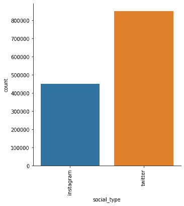
We now look at the distribution of our users based on social platform. We can see that twitter is the most popular by almost double.
fig = sns.catplot(x="social_type", kind="count", data=df, hue=None)
fig.set_xticklabels(rotation=90)
plt.show()
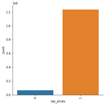
Photo usage is also quite high, which is to be expected. Most users have added a photo which is common on a social media platform.
fig = sns.catplot(x="has_photo", kind="count", data=df, hue=None)
fig.set_xticklabels(rotation=90)
plt.show()
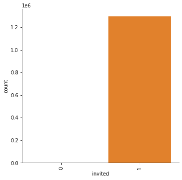
Here, we can clearly see that the majority of users were invited. Clubhouse is a primarily invite only, which is a nice referal growth tactice. From the plot, you can't really see how many users weren't invited.
Remember from our table before that the "null" invite was the number of users not invited. We use the value_counts method to display those results again.
fig = sns.catplot(x="invited", kind="count", data=df, hue=None)
fig.set_xticklabels(rotation=90)
plt.show()df['invited'].value_counts()1 1297301
0 3214
Name: invited, dtype: int64Now, we turn our attention to the numerical features. We loop through each of these and plot boxplots of each.
columns = ['num_followers', 'num_following']

figure = plt.figure(figsize=(20, 10))
figure.add_subplot(1, len(columns), 1)

for index, col in enumerate(columns):
    if index > 0:
        figure.add_subplot(1, len(columns), index + 1)
    sns.boxplot(y=col, data=df, boxprops={'facecolor': 'None'})

figure.tight_layout()
plt.show()
The plots above are hard to gather any information from. The box plots show a large amount of outliers. This might suggest that there is a small minority of users using the two features we describe.
From the left, that would be that there is a minority of users with the majority of followers.
On right right, that would suggest that a minority of users following a lot of users.
We would probably need to look at more data to get an idea of what's going on, but the left plot does help know where our distribtion of "popular" users are.
Bivariate or (Multi) Analysis
In this section, we would like to review two or more vairables at a time. This would give us an idea of the relationship between variables.
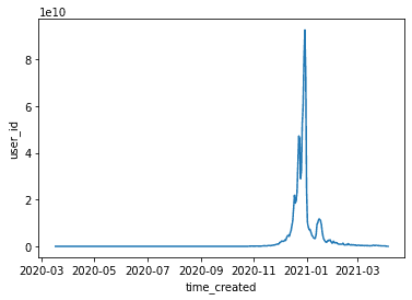
However, we don't have too much data. There is really only one question I have left which is the count of new users over time. This would tell us what the grow of Clubhouse is like.
df_copy = df.copy()
df_time = df_copy.set_index('time_created')
df_agg_day = df_time.resample('D').sum()
sns.lineplot(data=df_agg_day, x="time_created", y="user_id")
<AxesSubplot:xlabel='time_created', ylabel='user_id'>From the plot above, we can see that the over all user groth surged in Jan 2021, but dipped since. There also seems to be a downward trend. This is common with a viral spike. Let's look at the recent dates so that we can determine if Clubhouse has stabilized.
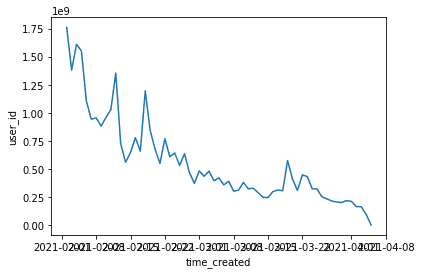
df_reset = df_agg_day.reset_index()
recent = df_reset[df_reset['time_created'] > '02-01-2021']
sns.lineplot(data=recent, x="time_created", y="user_id")
<AxesSubplot:xlabel='time_created', ylabel='user_id'>From Feb to March, the number of new users seems to be low. So either our data is missing information or Clubhouse seemst to be decreasing growth.
Note, that they could still have a stable usage data, this data is only on created accounts. Also, they data could be wrong or inauthentic.
Conclusion
I hope you have enjoyed this brief exploritory data analysis of Clubhouse data. I hope if gives you some insights into how to view your own users data in the future. Please leave comments and let me know if you have any questions. I'm happy to help you answer questions on other data sets as well.
