How to Create a Box Plot in Seaborn
01.23.2021
Intro
When viewing a contious variable, it is often helpful to calculate a few statistics such as mean, quantiles, variance and outliser. A boxplot helps you visualize this information in a simple chart. In this article, we will learn how to create a boxplot in the Seaborn library.
## Import the Library
import seaborn as sns
We will load the expercise data set the comes with the seaborn library.
exercise = sns.load_dataset("exercise")exercise.head()| Unnamed: 0 | id | diet | pulse | time | kind | |
|---|---|---|---|---|---|---|
| 0 | 0 | 1 | low fat | 85 | 1 min | rest |
| 1 | 1 | 1 | low fat | 85 | 15 min | rest |
| 2 | 2 | 1 | low fat | 88 | 30 min | rest |
| 3 | 3 | 2 | low fat | 90 | 1 min | rest |
| 4 | 4 | 2 | low fat | 92 | 15 min | rest |
The Basic Seaborn Boxplot
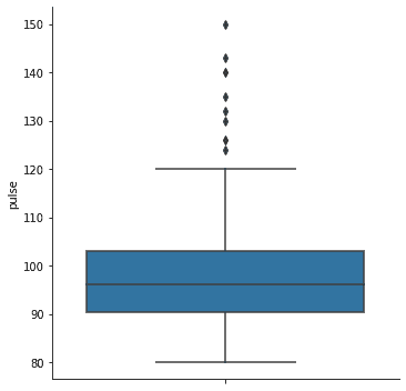
To create box plots in seaborn, we could use the sns.boxplot method. However, we will use the wrapper method sns.catplot which wraps plots and allows us to easily display multiple plots togther. We can use the kind parameter to change the plot easily. For our example, we will use kind= "box".
sns.catplot(
    kind = "box",
    y = "pulse",
    data = exercise
)
<seaborn.axisgrid.FacetGrid at 0x2102cac96d0>
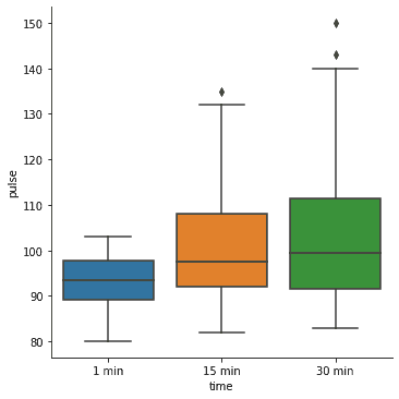
As I mentioned above, we can use the catplot method to easily plot multiple plots. Let's add a y variable and see that seaborn will add a plot for each category.
sns.catplot(
    kind = "box",
    x = "time",
    y = "pulse",
    data = exercise
)
<seaborn.axisgrid.FacetGrid at 0x2102cac9250>
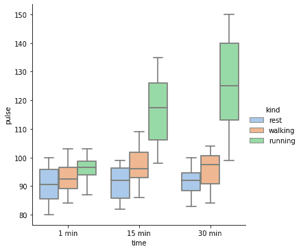
We can use the hue method to separate even more categories.
sns.catplot(
    kind = "box",
    x = "time",
    y = "pulse",
    hue = "kind",
    data = exercise
)
<seaborn.axisgrid.FacetGrid at 0x2102fd9cee0>

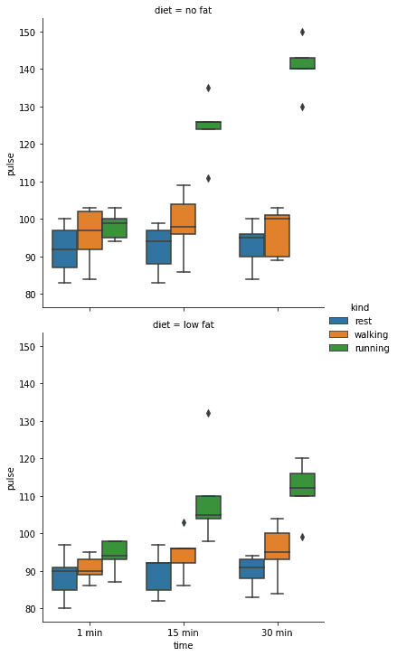
Faceting Seaborn Boxplots
Another great advandage of the catplot method is we can plot facets or grids of plots.
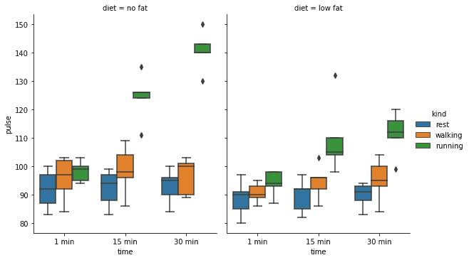
Let's start with ane example where we create a grid of columns. Each column in this example represents a diet.
sns.catplot( kind = "box", x = "time", y = "pulse", hue = "kind", col = "diet", data = exercise )
We can control the wrap using the col_wrap parameter. We set this to 1 to have 1 plot per column.
sns.catplot(
    kind = "box",
    x = "time",
    y = "pulse",
    hue = "kind",
    col = "diet",
    col_wrap = 1,
    data = exercise
)
<seaborn.axisgrid.FacetGrid at 0x23b2bf8d070>
We can use the height and aspect params to change the size of the plots.
sns.catplot(
    kind = "box",
    x = "time",
    y = "pulse",
    hue = "kind",
    col = "diet",
    data = exercise,
    height = 5,
    aspect = .8
)
<seaborn.axisgrid.FacetGrid at 0x23b2ab3bf40>
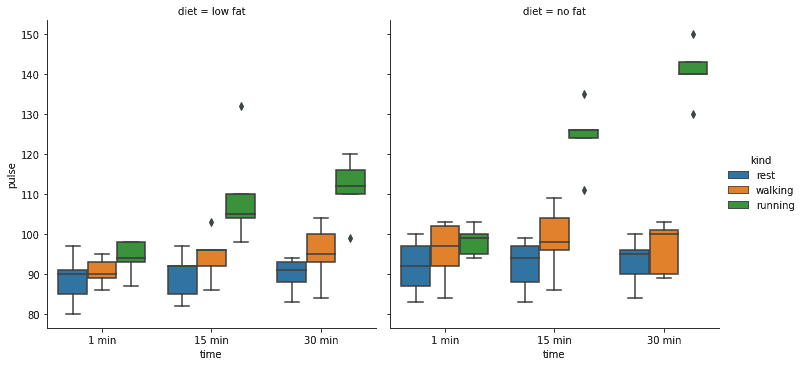
We can also change the order using the col_orders parameter.
sns.catplot(
    kind = "box",
    x = "time",
    y = "pulse",
    hue = "kind",
    col = "diet",
    col_order = ["low fat", "no fat"],
    data = exercise,
)
<seaborn.axisgrid.FacetGrid at 0x23b2c904040>
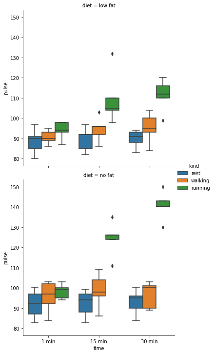
Similar to column, we can use the row paramter to separate the grid based on row.
sns.catplot(
    kind = "box",
    x = "time",
    y = "pulse",
    hue = "kind",
    row = "diet",
    data = exercise,
)
<seaborn.axisgrid.FacetGrid at 0x2102fdb81f0>

We also have the row_order column to control the row rendering.
sns.catplot(
    kind = "box",
    x = "time",
    y = "pulse",
    hue = "kind",
    row = "diet",
    row_order = ["low fat", "no fat"],
    data = exercise,
)
<seaborn.axisgrid.FacetGrid at 0x21030427be0>
Customize the Colors on Seaborn Boxplots
One final thing we will see is that we can use the palette parameter to customize the colors using built in color palletes. You can find more palletes here: https://seaborn.pydata.org/tutorial/color_palettes.html?highlight=palette#qualitative-color-palettes.
sns.catplot(
    kind = "box",
    x = "time",
    y = "pulse",
    hue = "kind",
    palette = "pastel",
    data = exercise,
)
<seaborn.axisgrid.FacetGrid at 0x21030a682b0>