
How to Create a Rug Plot in Python with Seaborn
01.19.2021
Intro
A rug plot is a simple plot to explore distributions of a continous variable. For example, let's say you want to explore salaries of employees. A rug plot will add a line for each salaray creating a dark dense area where the majority of salaries are located. In this article, we will see how to create a rug plot with Seaborn.
import seaborn as sns

tips = sns.load_dataset("tips")
tips.head()| total_bill | tip | sex | smoker | day | time | size | |
|---|---|---|---|---|---|---|---|
| 0 | 16.99 | 1.01 | Female | No | Sun | Dinner | 2 |
| 1 | 10.34 | 1.66 | Male | No | Sun | Dinner | 3 |
| 2 | 21.01 | 3.50 | Male | No | Sun | Dinner | 3 |
| 3 | 23.68 | 3.31 | Male | No | Sun | Dinner | 2 |
| 4 | 24.59 | 3.61 | Female | No | Sun | Dinner | 4 |
The Basic Seaborn Rug Plot
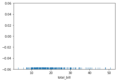
To create a basic rug plot, we use the rugplot method. We then pass the data we want to use and the key of the value we want to plot to the x named parameter. In this example, we create a rug plot from the total_bill column.
sns.rugplot(data = tips, x = "total_bill")<AxesSubplot:xlabel='total_bill'>
Adding Rug Plot to X and Y
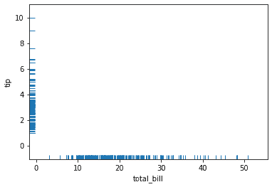
We can also plot a second rug plot on the y-axis. In this example, we have the preivous plot and we add the tip column to the y-axis.
sns.rugplot(data = tips, x = "total_bill", y = "tip")<AxesSubplot:xlabel='total_bill', ylabel='tip'>
Adding a Second Plot
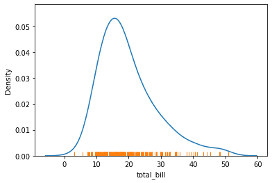
We can add a second plot to rugplot by first creating a plot then calling the rug plot. Here we add the kdeplot then call rugplot afterwards.
sns.kdeplot(data = tips, x = "total_bill")
sns.rugplot(data = tips, x = "total_bill")
<AxesSubplot:xlabel='total_bill', ylabel='Density'>
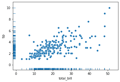
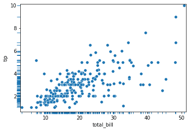
Here is a second example wiht the scatterplot.
sns.scatterplot(data = tips, x = "total_bill", y = "tip")
sns.rugplot(data = tips, x = "total_bill", y = "tip")
<AxesSubplot:xlabel='total_bill', ylabel='tip'>
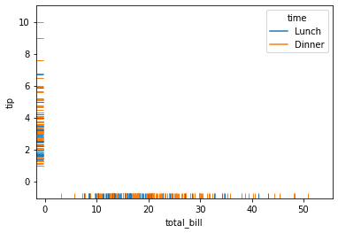
Displaying Groups
We can color different groups or categorical variables by using the hue parameter. In this example we color lunch time as blue and dinner as orange.
sns.rugplot(
    data = tips,
    x = "total_bill",
    y = "tip",
    hue = "time"
)
<AxesSubplot:xlabel='total_bill', ylabel='tip'>
Changing the Display
We can change the height of the rugplot by using the height parameter.
sns.rugplot(
    data = tips,
    x = "total_bill",
    y = "tip",
    height = .1
)
<AxesSubplot:xlabel='total_bill', ylabel='tip'>
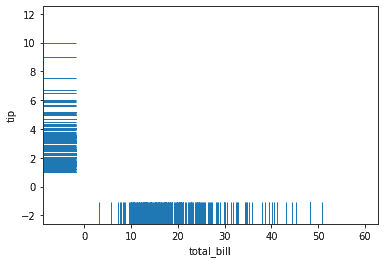
We can use the clip_on parameter and set it to False to get the rugplot to display outside of the plot.
sns.scatterplot(
    data = tips,
    x = "total_bill",
    y = "tip"
)
sns.rugplot(
    data = tips,
    x = "total_bill",
    y = "tip",
    height = -.02,
    clip_on = False
)
<AxesSubplot:xlabel='total_bill', ylabel='tip'>
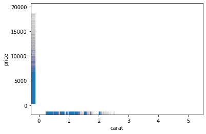
We can also change the line width and alpha using the lw and alpha parameters respectively.
diamonds = sns.load_dataset("diamonds")
sns.rugplot(
    data = diamonds,
    x = "carat",
    y = "price",
    lw = 1,
    alpha = .005
)
<AxesSubplot:xlabel='carat', ylabel='price'>
One final example is changing the palette using the palette parameter. You can find more palletes here: https://seaborn.pydata.org/tutorial/color_palettes.html?highlight=palette#qualitative-color-palettes.
sns.rugplot(
    data = tips,
    x = "total_bill",
    y = "tip",
    hue = "time",
    palette = 'pastel'
)
<AxesSubplot:xlabel='total_bill', ylabel='tip'>
