
How to Plot KMeans Clusters in Python
07.11.2021
Intro
When modeling clusters with algorithms such as KMeans, it is often helpful to plot the clusters and visualize the groups. This can be done rather simply by filtered our data set and using matplotlib, however, depending on the dimensions of your data set, there can be many ways to plot the clusters. In this article, we will learn how to plot KMeans clusters in Python.
Loading the Data
We begin by loading the iris data set from the sklearn package. We simply load the data and store the resulting data frame in a variable.
from sklearn.datasets import load_irisdf = load_iris(as_frame=True).data
df| sepal length (cm) | sepal width (cm) | petal length (cm) | petal width (cm) | |
|---|---|---|---|---|
| 0 | 5.1 | 3.5 | 1.4 | 0.2 |
| 1 | 4.9 | 3.0 | 1.4 | 0.2 |
| 2 | 4.7 | 3.2 | 1.3 | 0.2 |
| 3 | 4.6 | 3.1 | 1.5 | 0.2 |
| 4 | 5.0 | 3.6 | 1.4 | 0.2 |
| ... | ... | ... | ... | ... |
| 145 | 6.7 | 3.0 | 5.2 | 2.3 |
| 146 | 6.3 | 2.5 | 5.0 | 1.9 |
| 147 | 6.5 | 3.0 | 5.2 | 2.0 |
| 148 | 6.2 | 3.4 | 5.4 | 2.3 |
| 149 | 5.9 | 3.0 | 5.1 | 1.8 |
150 rows × 4 columns
Fitting the Kmeans Model
Our next step is to fit a kmeans model. We won't go into too much detail here about tuning the model. For now, we will just select 3 clusters and then predict using fit_predict on our dataset. This results in an array containing predicted clusters for each row in our data frame.
from sklearn.cluster import KMeans

kmeans = KMeans(n_clusters = 3)

label = kmeans.fit_predict(df)

print(label)
[0 0 0 0 0 0 0 0 0 0 0 0 0 0 0 0 0 0 0 0 0 0 0 0 0 0 0 0 0 0 0 0 0 0 0 0 0
0 0 0 0 0 0 0 0 0 0 0 0 0 1 1 2 1 1 1 1 1 1 1 1 1 1 1 1 1 1 1 1 1 1 1 1 1
1 1 1 2 1 1 1 1 1 1 1 1 1 1 1 1 1 1 1 1 1 1 1 1 1 1 2 1 2 2 2 2 1 2 2 2 2
2 2 1 1 2 2 2 2 1 2 1 2 1 2 2 1 1 2 2 2 2 2 1 2 2 2 2 1 2 2 2 1 2 2 2 1 2
2 1]Plotting the KMeans Clusters
To plot the data, we can first filter our data set by the labels. This will give us three data sets with the rows filtered into their predicted clusters.
label_0 = df[label == 0]
label_1 = df[label == 1]
label_2 = df[label == 2]
Now there are many ways to plot the data. The idea here is to plot our data sets and compare their respective features. Then, color the obeservations by their cluster.
Let's start by plotting two of our clusters. We will compare sepal length (cm) which is the first column to sepal width (cm) the second column.
import matplotlib.pyplot as plt


cols = filtered_label0.columns

plt.scatter(label_0[cols[0]], label_0[cols[1]], color = 'red')
plt.scatter(label_1[cols[0]], label_1[cols[1]], color = 'black')
plt.show()
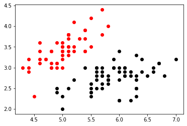
In the graph above it is easy to see the speration of the first and second cluster when viewing length and width. Let's add our third cluster now.
plt.scatter(label_0[cols[0]] , label_0[cols[1]], color = 'red')
plt.scatter(label_1[cols[0]] , label_1[cols[1]], color = 'black')
plt.scatter(label_2[cols[0]] , label_2[cols[1]], color = 'green')
plt.show()
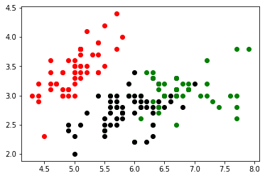
Here we can see some slight overlap between the second and third cluster suggesting they could be combined, but there is still a nice separation.
Let's try to plot two different columns now. We will use the second and third column which represent sepal width (cm) and petal length (cm) respectively.
plt.scatter(label_0[cols[1]] , label_0[cols[2]], color = 'red')
plt.scatter(label_1[cols[1]] , label_1[cols[2]], color = 'black')
plt.scatter(label_2[cols[1]] , label_2[cols[2]], color = 'green')
plt.show()
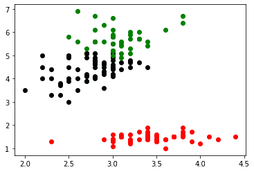
Now, we could continue this way for each pair of features. For small data sets like this that is not a huge problem. For larger data sets, you may want to use feature reduction techniques such as PCA to only plot combinations of features that are important.