How to Plot a Timeseries in Python
07.12.2021
Intro
When working with time series models, we would often like to plot the data to see how it changes over time. This is a simply line plot, but the x-axis is always dates. In this article, we will learn how to plot a time series in R.
Data
Lett's load a data set of monthly milk production. We will load it from the url below. The data consists of monthly intervals and kilograms of milk produced.
import pandas as pddata = 'https://raw.githubusercontent.com/ourcodingclub/CC-time-series/master/monthly_milk.csv'
df = pd.read_csv(data)
df.head()| month | milk_prod_per_cow_kg | |
|---|---|---|
| 0 | 1962-01-01 | 265.05 |
| 1 | 1962-02-01 | 252.45 |
| 2 | 1962-03-01 | 288.00 |
| 3 | 1962-04-01 | 295.20 |
| 4 | 1962-05-01 | 327.15 |
Next, we want to convert our month column to a python datetime object. We can use the to_datetime method to do this.
df['month'] = pd.to_datetime(df['month'])Plotting a Timeseries
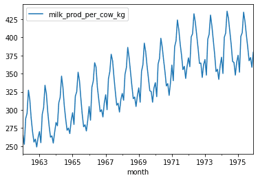
Next, we want to set the index of our data frame to the month column. This is not required to plot that data, but is a good practice when working with time series. This new index will make plotting, indexing, and aggregating with pandas easier for dates.
Once we have a data frame indexed on a date, we can call the plot method with kind='line' to create a line plot.
import matplotlib

df_ts = df.set_index('month')
df_ts.plot(kind = 'line')
<AxesSubplot:xlabel='month'>
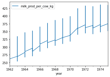
Now that we know how to create a basic plot, we can also customize our plot a bit. Let's say we would like to plot the yearly data instead. We could use upsampling (this will be covered in a separate article). We can also update our date column to display only the years.
We will use .dt.to_period method to change our date to years Y. Then we will drop the month column and use our new year column as our index.
df['year'] = pd.to_datetime(df['month']).dt.to_period('Y')
year_df = df.drop('month', axis=1)
year_df.head()| milk_prod_per_cow_kg | year | |
|---|---|---|
| 0 | 265.05 | 1962 |
| 1 | 252.45 | 1962 |
| 2 | 288.00 | 1962 |
| 3 | 295.20 | 1962 |
| 4 | 327.15 | 1962 |
year_df.set_index('year').plot(kind = 'line')<AxesSubplot:xlabel='year'>