
How to Create an Area Plot with ggplot2 in R
05.22.2021
Intro
Area plots are similar to line plots, however, they express the magnitude more clearly. They do this by coloring in the area underneath the line. In this article, we will learn how to create area plots with ggplot2 in R
If you are in a hurry
If you are in a hurry, here is the basic code for you to use.
library(ggplot2)

data(EuStockMarkets)
df = as.data.frame(EuStockMarkets)

ggplot(df) +
  geom_area(aes(x = seq_along(SMI), y = SMI, fill = 1)) +
  geom_area(aes(x = seq_along(DAX), y = DAX, fill = 2))

Loading the Data
For this tutorial, we will load the EuStockMarkets data set that comes with R We can do this with the following.
library(tidyverse)## -- Attaching packages --------------------------------------- tidyverse 1.3.1 --
## v tibble 3.1.0 v dplyr 1.0.5
## v tidyr 1.1.3 v stringr 1.4.0
## v readr 1.4.0 v forcats 0.5.1
## v purrr 0.3.4
## -- Conflicts ------------------------------------------ tidyverse_conflicts() --
## x dplyr::filter() masks stats::filter()
## x dplyr::lag() masks stats::lag()data(EuStockMarkets)
df = as.data.frame(EuStockMarkets)
glimpse(df)## Rows: 1,860
## Columns: 4
## $ DAX <dbl> 1628.75, 1613.63, 1606.51, 1621.04, 1618.16, 1610.61, 1630.75, 16~
## $ SMI <dbl> 1678.1, 1688.5, 1678.6, 1684.1, 1686.6, 1671.6, 1682.9, 1703.6, 1~
## $ CAC <dbl> 1772.8, 1750.5, 1718.0, 1708.1, 1723.1, 1714.3, 1734.5, 1757.4, 1~
## $ FTSE <dbl> 2443.6, 2460.2, 2448.2, 2470.4, 2484.7, 2466.8, 2487.9, 2508.4, 2~Basic Area Plot
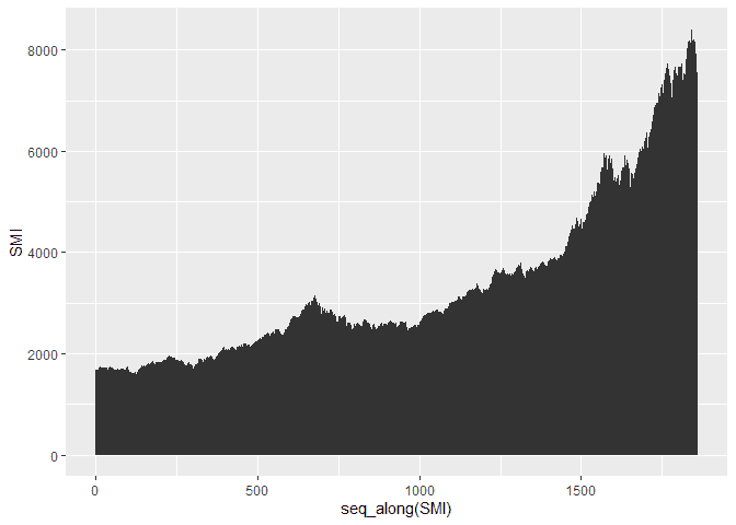
To build the basic area plot, we can use the geom_area method. We can
use this plot to see the change in stocks over time.
library(ggplot2)

ggplot(df, aes(x = seq_along(SMI), y = SMI)) +
  geom_area()
Customizing the Area Plot
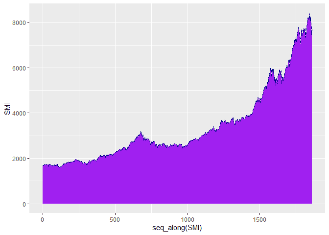
We can also customize the plot using the color, fill and linetype
paramters of the geom_area function. Here is an example changing the
colors.
ggplot(df, aes(x = seq_along(SMI), y = SMI)) +
  geom_area(color="darkblue", fill="purple", linetype = "dashed")
Plotting Groups
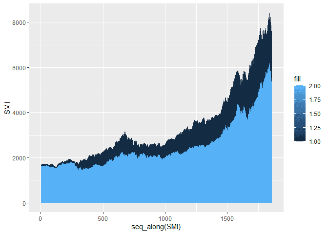
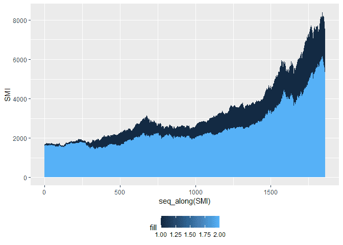
Often, we would like to plot several groups together. We can move our
aes aesthetic to the geom_area function and add more geom_area to
our plot to add multiple area plots to the same plot.
ggplot(df) +
  geom_area(aes(x = seq_along(SMI), y = SMI, fill = 1)) +
  geom_area(aes(x = seq_along(DAX), y = DAX, fill = 2))
Customize the Legend
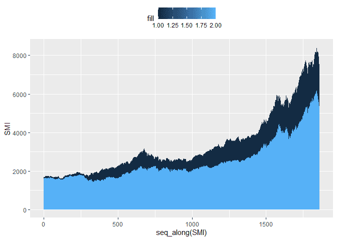
Once we are plotting multiple plots, ggplot2 will add a legend for us.
We can customize the legend using the theme function and the
legend.position parameter. Here are three examples of moving the
legend to the top, bottom, and removing it.
ggplot(df) +
  geom_area(aes(x = seq_along(SMI), y = SMI, fill = 1)) +
  geom_area(aes(x = seq_along(DAX), y = DAX, fill = 2)) +
  theme(legend.position="top")
ggplot(df) +
  geom_area(aes(x = seq_along(SMI), y = SMI, fill = 1)) +
  geom_area(aes(x = seq_along(DAX), y = DAX, fill = 2)) +
  theme(legend.position="bottom")
ggplot(df) +
  geom_area(aes(x = seq_along(SMI), y = SMI, fill = 1)) +
  geom_area(aes(x = seq_along(DAX), y = DAX, fill = 2)) +
  theme(legend.position="none")
