How to Create a ggplot Frequency Plot in R
05.27.2021
Intro
A Frequency plot is similar to a Histogram as it bins the count of continuous data. However, instead of using bars to display, it will use a line plot. In this article, we will learn how to create ggplot frequency plots in R.
For those who are in a Hurry
For those with little time, here is a quick snippet of box plots. Read on for more details.
library(tidyverse)## -- Attaching packages --------------------------------------- tidyverse 1.3.1 --
## v ggplot2 3.3.3 v purrr 0.3.4
## v tibble 3.1.0 v dplyr 1.0.5
## v tidyr 1.1.3 v stringr 1.4.0
## v readr 1.4.0 v forcats 0.5.1
## -- Conflicts ------------------------------------------ tidyverse_conflicts() --
## x dplyr::filter() masks stats::filter()
## x dplyr::lag() masks stats::lag()data(diamonds)
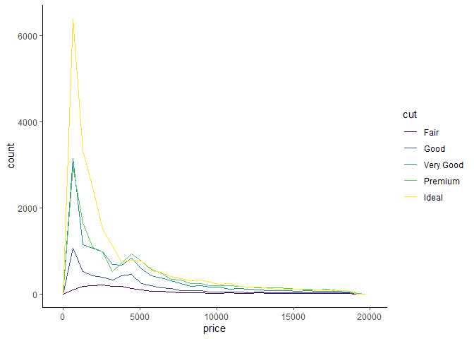
ggplot(diamonds, aes(x = price, colour = cut)) +
geom_freqpoly(binwidth = 50)

Loading the Data
For our tutorial, we will use the diamonds data set that comes with
the ggplot package.
library(tidyverse)

data(diamonds)

glimpse(diamonds)
## Rows: 53,940
## Columns: 10
## $ carat <dbl> 0.23, 0.21, 0.23, 0.29, 0.31, 0.24, 0.24, 0.26, 0.22, 0.23, 0.~
## $ cut <ord> Ideal, Premium, Good, Premium, Good, Very Good, Very Good, Ver~
## $ color <ord> E, E, E, I, J, J, I, H, E, H, J, J, F, J, E, E, I, J, J, J, I,~
## $ clarity <ord> SI2, SI1, VS1, VS2, SI2, VVS2, VVS1, SI1, VS2, VS1, SI1, VS1, ~
## $ depth <dbl> 61.5, 59.8, 56.9, 62.4, 63.3, 62.8, 62.3, 61.9, 65.1, 59.4, 64~
## $ table <dbl> 55, 61, 65, 58, 58, 57, 57, 55, 61, 61, 55, 56, 61, 54, 62, 58~
## $ price <int> 326, 326, 327, 334, 335, 336, 336, 337, 337, 338, 339, 340, 34~
## $ x <dbl> 3.95, 3.89, 4.05, 4.20, 4.34, 3.94, 3.95, 4.07, 3.87, 4.00, 4.~
## $ y <dbl> 3.98, 3.84, 4.07, 4.23, 4.35, 3.96, 3.98, 4.11, 3.78, 4.05, 4.~
## $ z <dbl> 2.43, 2.31, 2.31, 2.63, 2.75, 2.48, 2.47, 2.53, 2.49, 2.39, 2.~The Basic ggplot Frequency Plot
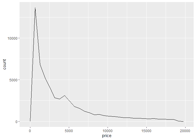
We can create a frequency plot by adding the geom_freqpoly geom to our
ggplot. Below is an example of plotting the price of diamonds.
library(ggplot2)

ggplot(diamonds, aes(x = price)) +
  geom_freqpoly()
## `stat_bin()` using `bins = 30`. Pick better value with `binwidth`.
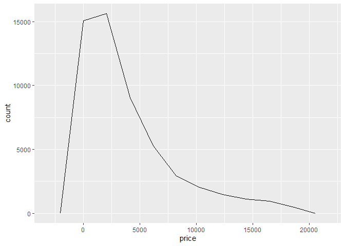
Frequency plot will automatically select bins for your continous
varaibles and plot how many observations fall into those bins. If you
would like to control the bin width, you can pass the bins paramter to
the geom.
ggplot(diamonds, aes(x = price)) +
  geom_freqpoly(bins=10)
Customizing the ggplot Frequency Plot
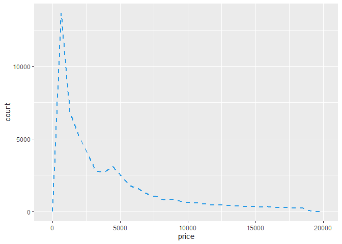
We can customize our box plots using some parameters on the
geom_freqpoly method. For example, we can change the color using the
color named parameter. Here is an example.
ggplot(diamonds, aes(x = price)) +
  geom_freqpoly(
    color = 4,
    lwd = 1,
    linetype = 2
  )
## `stat_bin()` using `bins = 30`. Pick better value with `binwidth`.
Customize the labels on the ggplot Frequency Plot
We can adjust the title, x-label, and y-label of our box plot using the
labs method. We then pass the title, x and y parameters.
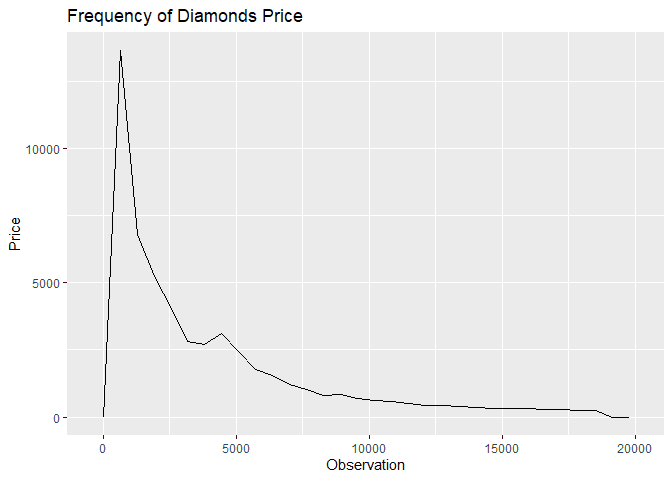
ggplot(diamonds, aes(x = price)) +
  geom_freqpoly() +
  labs(
    title = "Frequency of Diamonds Price",
    x = "Observation",
    y = "Price"
  )
## `stat_bin()` using `bins = 30`. Pick better value with `binwidth`.
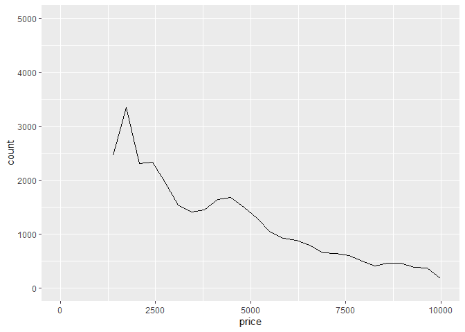
Limiting X and Y on a ggplot Frequency Plot
If we would like to limit the y values of our plots, we can use the
ylimit function
ggplot(diamonds, aes(x = price)) +
  geom_freqpoly() +
  xlim(10, 10000) +
  ylim(0, 5000)
## `stat_bin()` using `bins = 30`. Pick better value with `binwidth`.
## Warning: Removed 5222 rows containing non-finite values (stat_bin).
## Warning: Removed 3 row(s) containing missing values (geom_path).
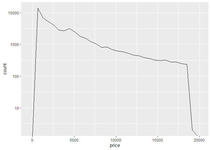
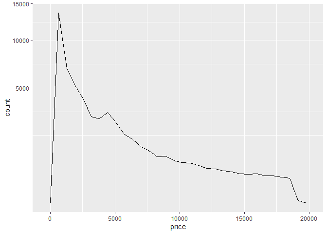
Scaling X and Y
We can also scale the y axis using the scale_ function from ggplot.
Here are some example of a log10 and sqrt scale of the y axis.
ggplot(diamonds, aes(x = price)) +
  geom_freqpoly() +
  scale_y_log10()
## `stat_bin()` using `bins = 30`. Pick better value with `binwidth`.
## Warning: Transformation introduced infinite values in continuous y-axis
ggplot(diamonds, aes(x = price)) +
  geom_freqpoly() +
  scale_y_sqrt()
## `stat_bin()` using `bins = 30`. Pick better value with `binwidth`.
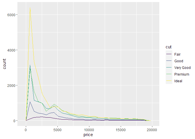
Groups by Color
We can color the separate groups of our violin plots by using the fill
or colour aesthetic properties. Here is an example of using the fill
to assign colors to each factor.
library(ggplot2)
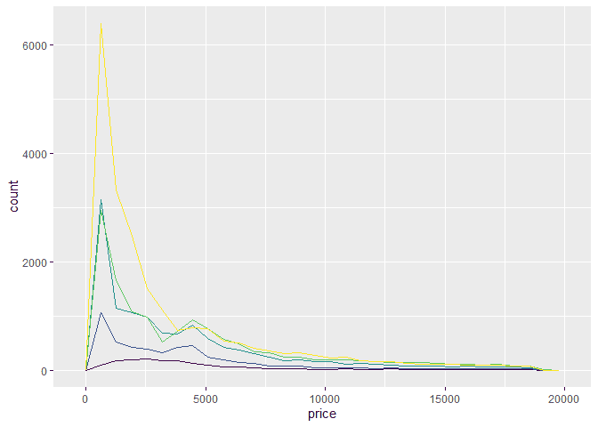
ggplot(diamonds, aes(x = price, colour = cut, fill = cut)) +
geom_freqpoly()## `stat_bin()` using `bins = 30`. Pick better value with `binwidth`.
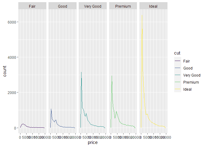
Facets
If we prefer to have separate plots, we can use the facet_ methods in
ggplot. For example, here are plots separated by each cut.
library(ggplot2)

ggplot(diamonds, aes(x = price, colour = cut, fill = cut)) +
  geom_freqpoly() +
  facet_grid(~cut)
## `stat_bin()` using `bins = 30`. Pick better value with `binwidth`.
Color and Fill Scales
There are many color options in ggplot. We can use scale_ methods like
scale_fill_brewer() to have ggplot automatically assign different
themes based on our data set.
library(ggplot2)

ggplot(diamonds, aes(x = price, colour = cut, fill = cut)) +
  geom_freqpoly() +
  scale_fill_brewer()
## `stat_bin()` using `bins = 30`. Pick better value with `binwidth`.

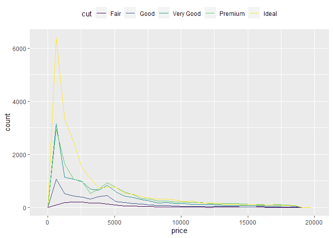
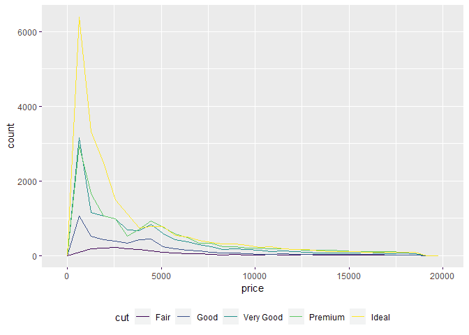
Customizing the Legend
When we have groups, ggplot will add a legend to the plot. We can
customize the position of this legend using the theme method and the
legend.position parameter. Here are example of moving the legend to
the top, bottom, and hiding it.
ggplot(diamonds, aes(x = price, colour = cut, fill = cut)) +
  geom_freqpoly() +
  theme(legend.position="top")
## `stat_bin()` using `bins = 30`. Pick better value with `binwidth`.
ggplot(diamonds, aes(x = price, colour = cut, fill = cut)) +
  geom_freqpoly() +
  theme(legend.position="bottom")
## `stat_bin()` using `bins = 30`. Pick better value with `binwidth`.
ggplot(diamonds, aes(x = price, colour = cut, fill = cut)) +
  geom_freqpoly() +
  theme(legend.position="none")
## `stat_bin()` using `bins = 30`. Pick better value with `binwidth`.
Using Themes
If we want to use built in styles for the full plot, ggplot provides
themes to add to our plot. Here is an example of adding the
theme_classic to our plot.
ggplot(diamonds, aes(x = price, colour = cut, fill = cut)) +
  geom_freqpoly() +
  theme_classic()
## `stat_bin()` using `bins = 30`. Pick better value with `binwidth`.