How to Create a ggplot Jitter Plot in R
05.28.2021
Intro
Jitter plots add some variation to a scatter plot so that you can see the individual observations easier. They are commonly used when viewing overlapping points from data that is discrete. In this artilce, we will learn how to create ggplot Jitter plots in R.
If you are in a rush
For those with little time, here is a quick snippet of Jitter plots. Read on for more details.
library(tidyverse)## -- Attaching packages --------------------------------------- tidyverse 1.3.1 --
## v ggplot2 3.3.3 v purrr 0.3.4
## v tibble 3.1.0 v dplyr 1.0.5
## v tidyr 1.1.3 v stringr 1.4.0
## v readr 1.4.0 v forcats 0.5.1
## -- Conflicts ------------------------------------------ tidyverse_conflicts() --
## x dplyr::filter() masks stats::filter()
## x dplyr::lag() masks stats::lag()data(mpg)
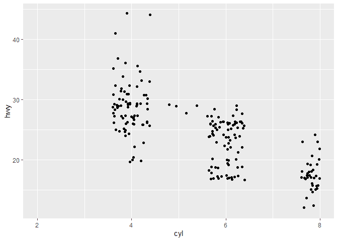
ggplot(mpg, aes(x = cyl, y = hwy)) +
geom_jitter()
Loading the Data
For our tutorial, we will use the mpg data set that comes with the
ggplot package.
library(tidyverse)

data(mpg)

glimpse(mpg)
## Rows: 234
## Columns: 11
## $ manufacturer <chr> "audi", "audi", "audi", "audi", "audi", "audi", "audi", "~
## $ model <chr> "a4", "a4", "a4", "a4", "a4", "a4", "a4", "a4 quattro", "~
## $ displ <dbl> 1.8, 1.8, 2.0, 2.0, 2.8, 2.8, 3.1, 1.8, 1.8, 2.0, 2.0, 2.~
## $ year <int> 1999, 1999, 2008, 2008, 1999, 1999, 2008, 1999, 1999, 200~
## $ cyl <int> 4, 4, 4, 4, 6, 6, 6, 4, 4, 4, 4, 6, 6, 6, 6, 6, 6, 8, 8, ~
## $ trans <chr> "auto(l5)", "manual(m5)", "manual(m6)", "auto(av)", "auto~
## $ drv <chr> "f", "f", "f", "f", "f", "f", "f", "4", "4", "4", "4", "4~
## $ cty <int> 18, 21, 20, 21, 16, 18, 18, 18, 16, 20, 19, 15, 17, 17, 1~
## $ hwy <int> 29, 29, 31, 30, 26, 26, 27, 26, 25, 28, 27, 25, 25, 25, 2~
## $ fl <chr> "p", "p", "p", "p", "p", "p", "p", "p", "p", "p", "p", "p~
## $ class <chr> "compact", "compact", "compact", "compact", "compact", "c~Creating a Basic ggplot Jitter Plot
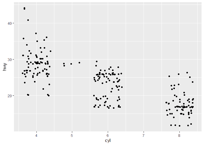
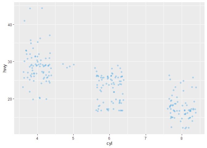
To create a Jitter plot in ggplot2, we can use the geom_jitter method
after supplying a continuous variable to the y of our aes, aesthetic.
In this example, we will use height from the price data set above.
ggplot(mpg, aes(x = cyl, y = hwy)) +
  geom_jitter()
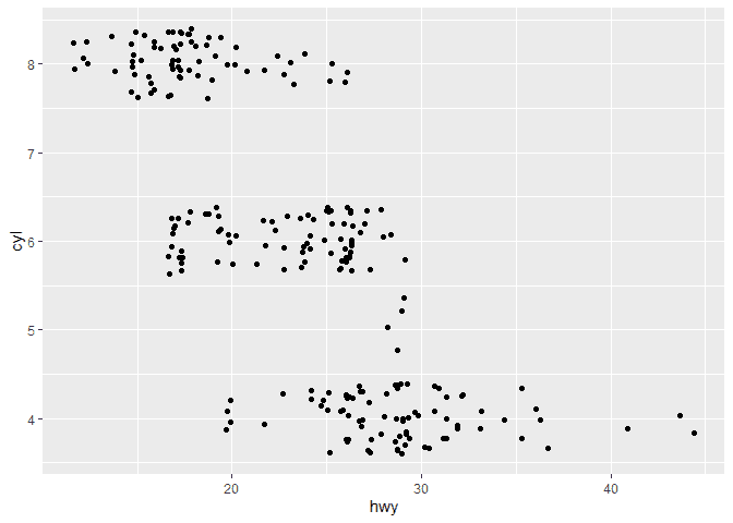
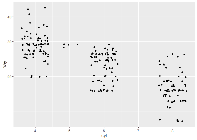
We can also flip the plot to orient horizontally by using the
coord_flip method.
ggplot(mpg, aes(x = cyl, y = hwy)) +
  geom_jitter() +
  coord_flip()
Customizing the ggplot Jitter Plot
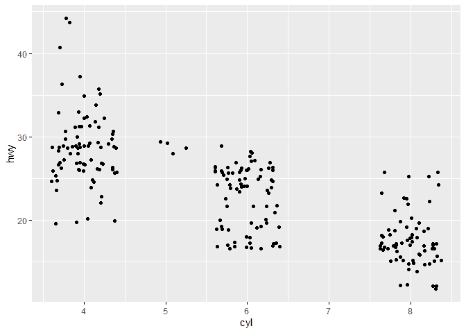
We can customize our Jitter plots using some parameters on the
geom_jitter method. For example, we can change the color using the
color named parameter. Here is an example.
ggplot(mpg, aes(x = cyl, y = hwy)) +
  geom_jitter(color = 4,
               fill = 4,
               alpha = 0.25)
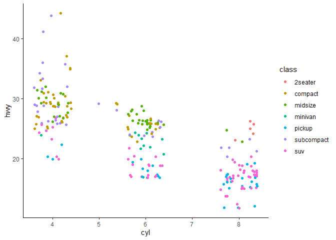
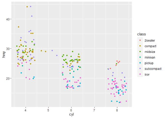
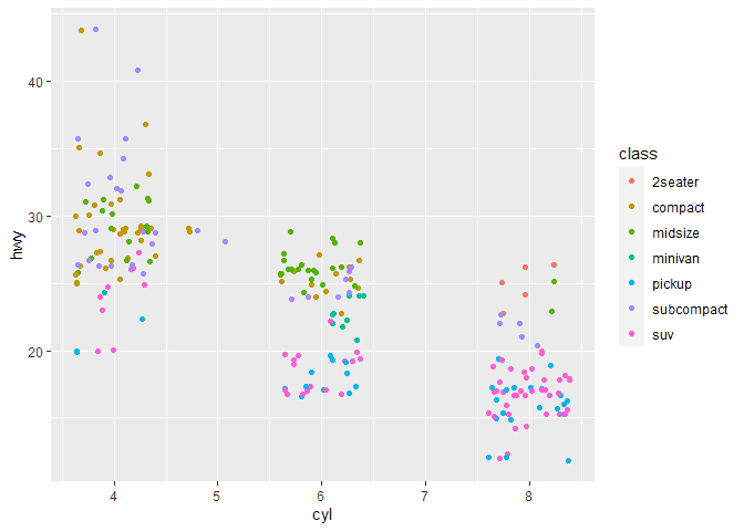
Group by Color
We can color the separate groups of our violin plots by using the fill
or colour aesthetic properties. Here is an example of using the
colour to assign colors to each factor.
library(ggplot2)


ggplot(mpg, aes(x = cyl, y = hwy, colour = class)) +
  geom_jitter()
Facets Groups on a ggplot Jitter Plot
If we prefer to have separate plots, we can use the facet_ methods in
ggplot. For example, here are plots separated by each class
library(ggplot2)

ggplot(mpg, aes(x = cyl, y = hwy, colour = class)) +
  geom_jitter() +
  facet_grid(~class)

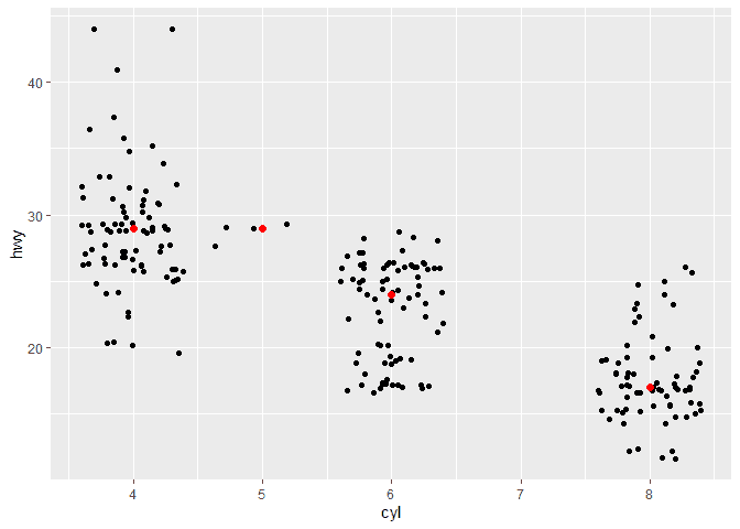
Adding Summary Information to a ggplot Jitter Plot
We can also add summary information to our Jitter plots to visualize in
addition to our distributions. For example, we can use the
stat_summary method to display the median like so.
ggplot(mpg, aes(x = cyl, y = hwy)) +
  geom_jitter() +
  stat_summary(
    fun.y = median,
    geom = "point",
    size = 2,
    color = "red"
   )
## Warning: `fun.y` is deprecated. Use `fun` instead.
Similarly, we can add the mean to each of our plots.
ggplot(mpg, aes(x = cyl, y = hwy)) +
  geom_jitter() +
  stat_summary(
    fun.y = mean,
    geom = "point",
    size = 2,
    color = "blue"
   )
## Warning: `fun.y` is deprecated. Use `fun` instead.

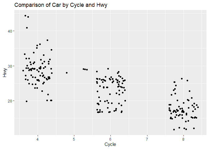
Adjusting the ggplot Jitter Plot Labels
We can adjust the title, x-label, and y-label of our Jitter plot using
the labs method. We then pass the title, x and y parameters.
ggplot(mpg, aes(x = cyl, y = hwy)) +
  geom_jitter() +
  labs(
    title = "Comparison of Car by Cycle and Hwy",
    x = "Cycle",
    y = "Hwy"
  )
Limiting X and Y
If we would like to limit the y values of our plots, we can use the
ylimit function
ggplot(mpg, aes(x = cyl, y = hwy)) +
  geom_jitter() +
  xlim(2, 8)
## Warning: Removed 35 rows containing missing values (geom_point).
ylim(20, 40)## <ScaleContinuousPosition>
## Range:
## Limits: 20 -- 40Scaling X and Y
We can also scale the y axis using the scale_ function from ggplot.
Here are some example of a log10 and sqrt scale of the y axis.
ggplot(mpg, aes(x = cyl, y = hwy)) +
  geom_jitter() +
  scale_y_log10()
ggplot(mpg, aes(x = cyl, y = hwy)) +
  geom_jitter() +
  scale_y_sqrt()
Color and Fill Scales
There are many color options in ggplot. We can use scale_ methods like
scale_fill_brewer() to have ggplot automatically assign different
themes based on our data set.
library(ggplot2)


ggplot(mpg, aes(x = cyl, y = hwy, colour = class)) +
  geom_jitter() +
  scale_fill_brewer()
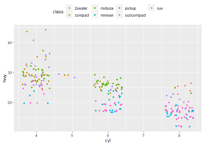
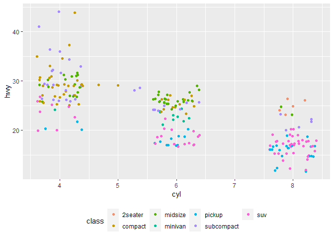
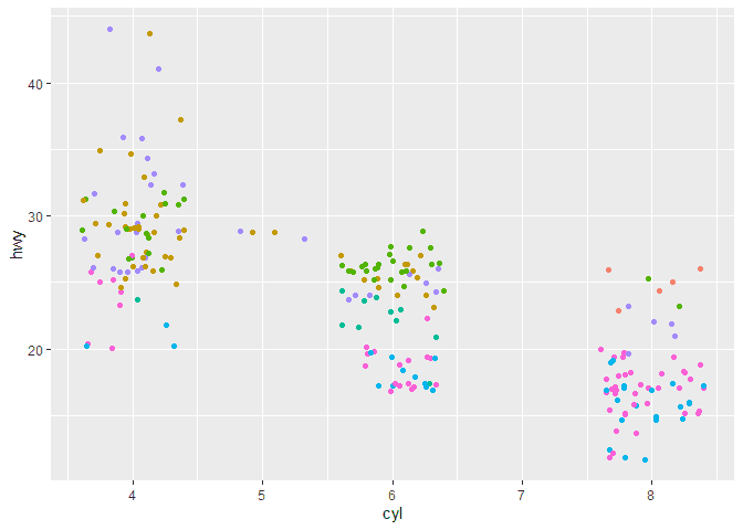
Customizing the Legend of a ggplot Jitter Plot
When we have groups, ggplot will add a legend to the plot. We can
customize the position of this legend using the theme method and the
legend.position parameter. Here are example of moving the legend to
the top, bottom, and hiding it.
ggplot(mpg, aes(x = cyl, y = hwy, colour = class)) +
  geom_jitter() +
  theme(legend.position="top")
ggplot(mpg, aes(x = cyl, y = hwy, colour = class)) +
  geom_jitter() +
  theme(legend.position="bottom")
ggplot(mpg, aes(x = cyl, y = hwy, colour = class)) +
  geom_jitter() +
  theme(legend.position="none")
Using Themes with a ggplot Jitter Plot
If we want to use built in styles for the full plot, ggplot provides
themes to add to our plot. Here is an example of adding the
theme_classic to our plot.
ggplot(mpg, aes(x = cyl, y = hwy, colour = class)) +
  geom_jitter() +
  theme_classic()