How to Create a ggplot Violin Plot in R
05.25.2021
Intro
Violin plots are used to summarize continuous variables. They are similar to box plots, as they provide summary statistics like mean and quantiles, but they also display the distribution. These distributions are helpful to visualize at the same time since summary statistics can misguide you. In this article, we will learn how to create violin plots in R with ggplot2.
If you are in a rush
For those with little time, here is a quick snippet of violin plots. Read on for more details.
library(tidyverse)## -- Attaching packages --------------------------------------- tidyverse 1.3.1 --
## v ggplot2 3.3.3 v purrr 0.3.4
## v tibble 3.1.0 v dplyr 1.0.5
## v tidyr 1.1.3 v stringr 1.4.0
## v readr 1.4.0 v forcats 0.5.1
## -- Conflicts ------------------------------------------ tidyverse_conflicts() --
## x dplyr::filter() masks stats::filter()
## x dplyr::lag() masks stats::lag()data(diamonds)
ggplot(diamonds, aes(x = cut, y = price)) +
geom_violin()

Loading the data
For our tutorial, we will use the diamonds data set that comes with
the ggplot package.
library(tidyverse)

data(diamonds)

glimpse(diamonds)
## Rows: 53,940
## Columns: 10
## $ carat <dbl> 0.23, 0.21, 0.23, 0.29, 0.31, 0.24, 0.24, 0.26, 0.22, 0.23, 0.~
## $ cut <ord> Ideal, Premium, Good, Premium, Good, Very Good, Very Good, Ver~
## $ color <ord> E, E, E, I, J, J, I, H, E, H, J, J, F, J, E, E, I, J, J, J, I,~
## $ clarity <ord> SI2, SI1, VS1, VS2, SI2, VVS2, VVS1, SI1, VS2, VS1, SI1, VS1, ~
## $ depth <dbl> 61.5, 59.8, 56.9, 62.4, 63.3, 62.8, 62.3, 61.9, 65.1, 59.4, 64~
## $ table <dbl> 55, 61, 65, 58, 58, 57, 57, 55, 61, 61, 55, 56, 61, 54, 62, 58~
## $ price <int> 326, 326, 327, 334, 335, 336, 336, 337, 337, 338, 339, 340, 34~
## $ x <dbl> 3.95, 3.89, 4.05, 4.20, 4.34, 3.94, 3.95, 4.07, 3.87, 4.00, 4.~
## $ y <dbl> 3.98, 3.84, 4.07, 4.23, 4.35, 3.96, 3.98, 4.11, 3.78, 4.05, 4.~
## $ z <dbl> 2.43, 2.31, 2.31, 2.63, 2.75, 2.48, 2.47, 2.53, 2.49, 2.39, 2.~Building the Basic ggplot Violin Plot
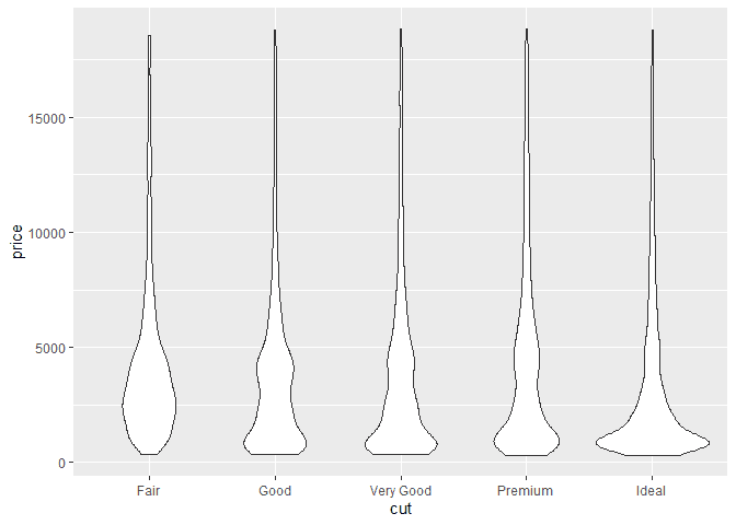
To create a violin plot, we can use the ggplot2 layer geom_violin. We
first create a plot with an aesthetic aes to include a factor, cut,
and the continous variabel price. This will allow us to see the
distributions of price accross the various diamond cuts.
ggplot(diamonds, aes(x = cut, y = price)) +
  geom_violin()
Customizing the ggplot Violin Plot
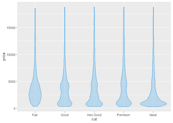
We can customize our violin plots using some paramters on the
geom_violin method. For example, we can change the color using the
color named parameter. Here is an example.
ggplot(diamonds, aes(x = cut, y = price)) +
  geom_violin(color = 4,
               fill = 4,
               alpha = 0.25)
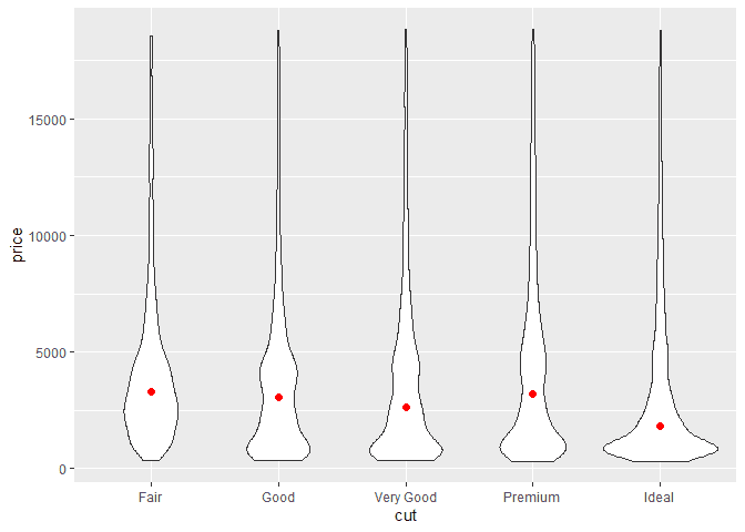
Adding Summary Information to a ggplot Violin Plot
We can also add summary information to our violin plots to visualize in
addition to our distributions. For example, we can use the
stat_summary method to display the median like so.
ggplot(diamonds, aes(x = cut, y = price)) +
  geom_violin() +
  stat_summary(
    fun.y = median,
    geom = "point",
    size = 2,
    color = "red"
   )
## Warning: `fun.y` is deprecated. Use `fun` instead.
Similarly, we can add the mean to each of our plots.
ggplot(diamonds, aes(x = cut, y = price)) +
  geom_violin() +
  stat_summary(
    fun.y = mean,
    geom = "point",
    size = 2,
    color = "blue"
   )
## Warning: `fun.y` is deprecated. Use `fun` instead.

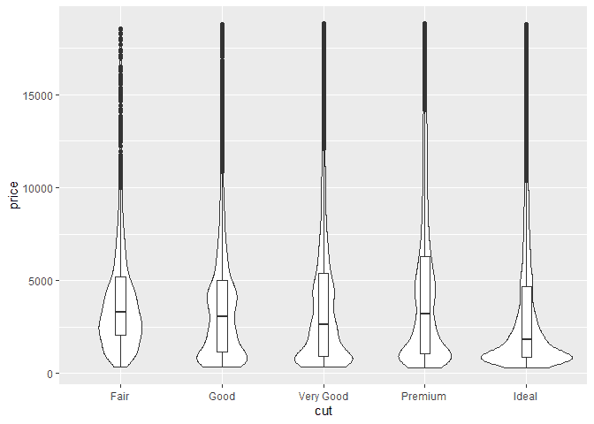
To add even more information, we can combine our plot with the
geom_boxplot to display many common summary information.
ggplot(diamonds, aes(x = cut, y = price)) +
  geom_violin() +
  geom_boxplot(width=0.1)
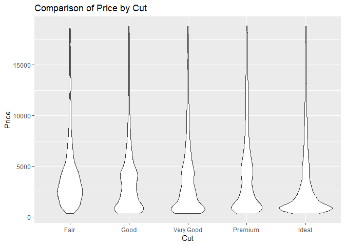
Adjusting the ggplot Violin Plot Labels
We can adjust the title, x-label, and y-label of our violin plot using
the labs method. We then pass the title, x and y parameters.
ggplot(diamonds, aes(x = cut, y = price)) +
  geom_violin() +
  labs(
    title = "Comparison of Price by Cut",
    x = "Cut",
    y = "Price"
  )
Limiting X and Y
If we would like to limit the y values of our plots, we can use the
ylimit function
ggplot(diamonds, aes(x = cut, y = price)) +
  geom_violin() +
  ylim(5000, 10000)
## Warning: Removed 44435 rows containing non-finite values (stat_ydensity).

Scaling X and Y
We can also scale the y axis using the scale_ function from ggplot.
Here are some example of a log10 and sqrt scale of the y axis.
ggplot(diamonds, aes(x = cut, y = price)) +
  geom_violin() +
  scale_y_log10()
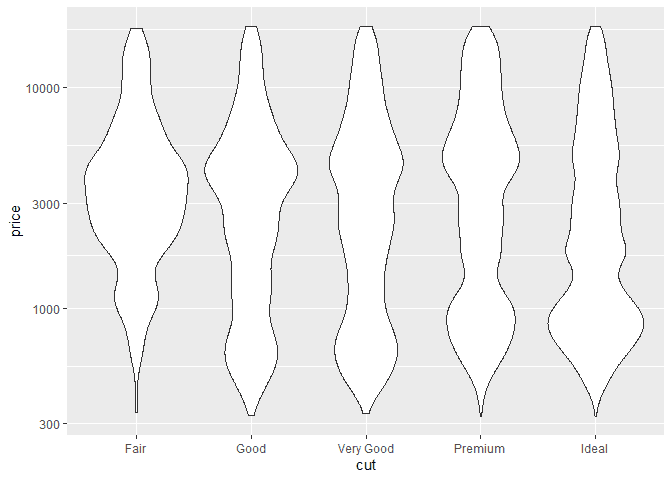
ggplot(diamonds, aes(x = cut, y = price)) +
  geom_violin() +
  scale_y_sqrt()

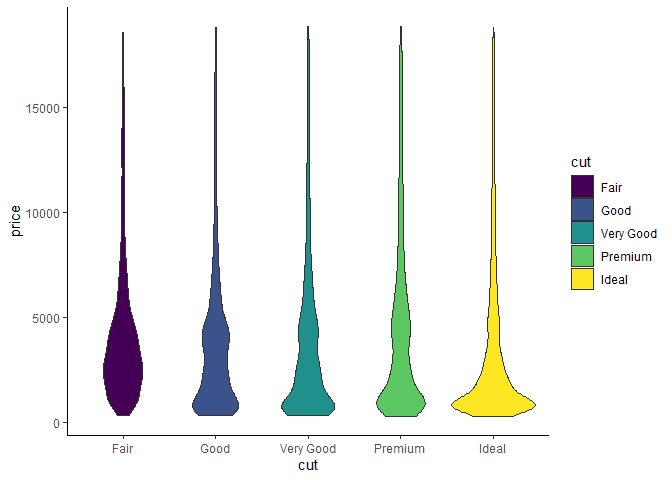
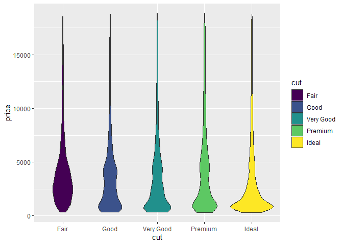
Group by Color
We can color the separate groups of our violin plots by using the fill
or colour aesthetic properties. Here is an example of using the fill
to assign colors to each factor.
library(ggplot2)


ggplot(diamonds, aes(x = cut, y = price, fill = cut)) +
  geom_violin()
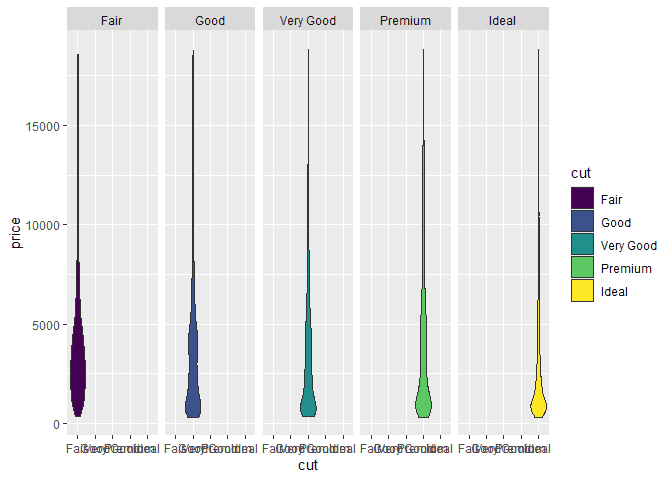
Facets Groups on a ggplot Violin Plot
If we prefer to have separate plots, we can use the facet_ methods in
ggplot. For example, here are plots separated by each cut.
library(ggplot2)

ggplot(diamonds, aes(x = cut, y = price, fill = cut)) +
  geom_violin() +
  facet_grid(~cut)
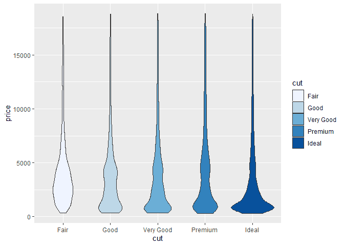
Color and Fill Scales
There are many color options in ggplot. We can use scale_ methods like
scale_fill_brewer() to have ggplot automatically assign different
themes based on our data set.
library(ggplot2)


ggplot(diamonds, aes(x = cut, y = price, fill = cut)) +
  geom_violin() +
  scale_fill_brewer()
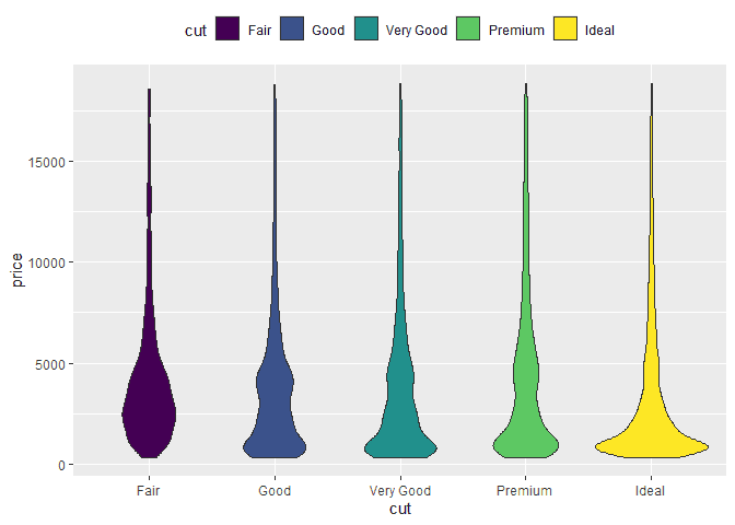
Customizing the Legend of a ggplot Violin Plot
When we have groups, ggplot will add a legend to the plot. We can
customize the position of this legend using the theme method and the
legend.position parameter. Here are example of moving the legend to
the top, bottom, and hiding it.
ggplot(diamonds, aes(x = cut, y = price, fill = cut)) +
  geom_violin() +
  theme(legend.position="top")
ggplot(diamonds, aes(x = cut, y = price, fill = cut)) +
  geom_violin() +
  theme(legend.position="bottom")

ggplot(diamonds, aes(x = cut, y = price, fill = cut)) +
  geom_violin() +
  theme(legend.position="none")

Using Themes with a ggplot Violin Plot
If we want to use built in styles for the full plot, ggplot provides
themes to add to our plot. Here is an example of adding the
theme_classic to our plot.
ggplot(diamonds, aes(x = cut, y = price, fill = cut)) +
  geom_violin() +
  theme_classic()