ACF Plot in R
07.15.2021
Intro
The autocorrelation function measures the correlations between an observation and its previous lag in a time series model. These functions are often used to determine which time series model to use. Based on the ACF graph, we usually see familiar patterns that allows us to select models or to rule out other models. In this article, we will learn how to create an ACF plot in R.
Loading the Data
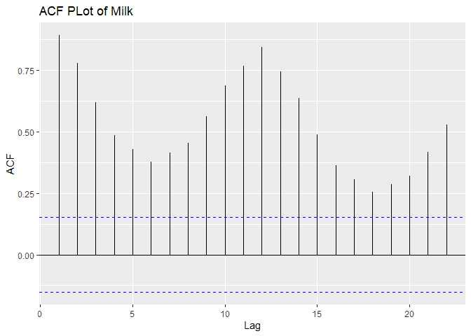
Let’s load a data set of monthly milk production. We will load it from the url below. The data consists of monthly intervals and kilograms of milk produced.
library(xts)## Loading required package: zoo
##
## Attaching package: 'zoo'
## The following objects are masked from 'package:base':
##
## as.Date, as.Date.numericdf <- read.csv('https://raw.githubusercontent.com/ourcodingclub/CC-time-series/master/monthly_milk.csv')
head(df)## month milk_prod_per_cow_kg
## 1 1962-01-01 265.05
## 2 1962-02-01 252.45
## 3 1962-03-01 288.00
## 4 1962-04-01 295.20
## 5 1962-05-01 327.15
## 6 1962-06-01 313.65## Convert to time series
ts <- ts(data = df$milk_prod_per_cow_kg, start = c(1962, 1, 1), frequency = 1)
## Convert to xts for time series features
ts <- as.xts(ts)
head(ts)## [,1]
## 1962-01-01 265.05
## 1963-01-01 252.45
## 1964-01-01 288.00
## 1965-01-01 295.20
## 1966-01-01 327.15
## 1967-01-01 313.65Plotting the ACF
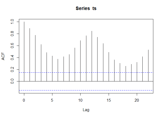
We can plot the auto correlation function of our time series using the
built in acf plot. Simply pass our time series to the acf function
and you will see the plot.
acf(ts)
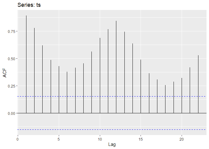
Another option we have is the fpp2 library’s ggAcf function which
will give you the features of the ggplot library along with the acf
plot.
library(fpp2)## Registered S3 method overwritten by 'quantmod':
## method from
## as.zoo.data.frame zoo
## -- Attaching packages ---------------------------------------------- fpp2 2.4 --
## v ggplot2 3.3.5 v fma 2.4
## v forecast 8.15 v expsmooth 2.3
## ggAcf(ts)
 Since
this is a ggplot, we can add the ggplot methods such as
Since
this is a ggplot, we can add the ggplot methods such as labs.
ggAcf(ts) + labs(title = "ACF PLot of Milk")