Plot ACF Python
07.16.2021
Intro
The autocorrelation function measures the correlations between an observation and its previous lag in a time series model. These functions are often used to determine which time series model to use. Based on the ACF graph, we usually see familiar patterns that allows us to select models or to rule out other models. In this article, we will learn how to create an ACF plot in R.
Loading the Data
Let's load a data set of monthly milk production. We will load it from the url below. The data consists of monthly intervals and kilograms of milk produced.
import pandas as pddf = pd.read_csv('https://raw.githubusercontent.com/ourcodingclub/CC-time-series/master/monthly_milk.csv')
df.head()| month | milk_prod_per_cow_kg | |
|---|---|---|
| 0 | 1962-01-01 | 265.05 |
| 1 | 1962-02-01 | 252.45 |
| 2 | 1962-03-01 | 288.00 |
| 3 | 1962-04-01 | 295.20 |
| 4 | 1962-05-01 | 327.15 |
df.month = pd.to_datetime(df.month)df = df.set_index('month')df.head()| milk_prod_per_cow_kg | |
|---|---|
| month | |
| 1962-01-01 | 265.05 |
| 1962-02-01 | 252.45 |
| 1962-03-01 | 288.00 |
| 1962-04-01 | 295.20 |
| 1962-05-01 | 327.15 |
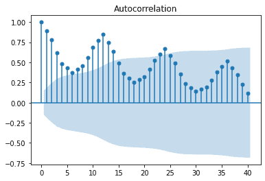
Plotting the ACF
We can plot the acf using the plot_acf method from the statsmodels package. In fact, that package as many different time series tools. Here is an example of plotting our milk with the last 40 lags.
from statsmodels.graphics.tsaplots import plot_acf


plot_acf(df.milk_prod_per_cow_kg, lags = 40)